+61-1300-332-888
 +1-480-241-8198
Our Blogs
Data itself speaks nothing, but visualization helps us to understand the data, through visualization we can get better insights that can help drive the business in the right direction.
In this blog we will be doing Univariate analysis (Plots for a single variable) using Matplotlib and Seaborn library to talk about different visualizations in Python.

Matplotlib is used for creating Static visualizations.Seaborn is made over top of Matplotlib and has a high level visualization.We will begin by importing Matplotlib, Seaborn, pandas and numpy libraries…
import matplotlib.pyplot as plt
import seaborn as sns
import numpy as np
import pandas as pd
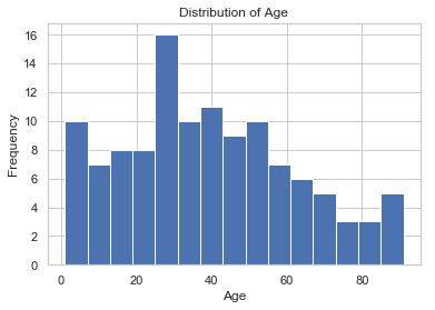
Histogram
It is one of the most and frequently used visualization. It represents the frequency distribution of a continuous variable. We can divide the data into bins as well.
Eg:-
Let us take some age data and analyze its frequency distribution…
Age=[1,1,1,2,2,2,2,3,3,5,7,8,9,10,10,11,11,13,13,15,16,17,18,18,18,19,20,21,21,23,24,24,43,42,41,22,34,54,56,66,54,32,54,54,67,25,25,25,25,26,26,26,26,27,27,27,27,27,29,30,30,31,33,34,34,34,35,36,36,37,37,38,38,39,40,41,41,42,43,44,45,45,46,47,48,48,49,50,51,52,53,54,55,55,56,57,58,60,61,63,64,65,66,68,70,71,72,74,75,77,81,83,84,87,89,90,90,91]
Let us plot a histogram to analyze the data…
plt.hist(age, bins=15)
plt.xlabel(‘Age’)
plt.ylabel(‘Frequency’)
plt.title(‘Distribution of Age’)
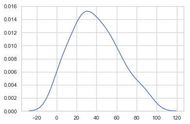
Kernel Density Plot
It is used to see the probability distribution of the variables and often used in data analytics to see whether the data follows a normal distribution or not.
Let us plot this
sns.kdeplot(age)
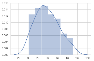
Distplot
Distplot combines both histogram and Kernel density plot together to give you a more enhanced version of the visualization.
sns.distplot(age)
Boxplot
It is one of the most used graphs for the detection of outliers.
Outliers are the observations that lie far away from majority of observations or you can say extreme values.
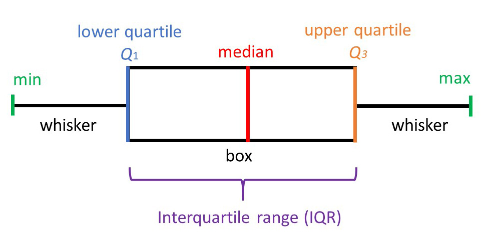
Any value that is beyond min and max is a outlier, so one can easily identify the presence of outlier through this
Let us see whether our age variable has outlier or not
sns.boxplot(age)
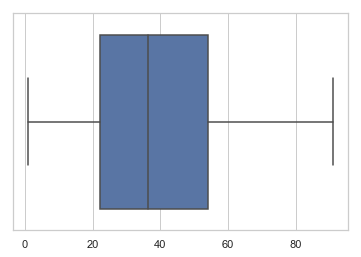
In the age variables there seems to be no outlier as none of the point is above or below min and max point.
Let us take another example…
a=[10,11,12,13,14,15,16,17,18,19,20,30,32]
In this we have created a variable and have deliberately entered two extreme values 30 and 32, let us see whether boxplot can identify them or not
sns.boxplot(a)
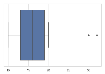
As you can clearly see boxplot has identified the presence of two outliers in the data as shown above.
Conclusion: Visualization is the key in data analysis and data exploration. This blog introduces you to different visualization techniques that can be used to know your data.
About Girikon
As an end-to-end provider of IT services, Girikons’ proficiency lies in offering Salesforce consulting, Salesforce implementation and Salesforce support services. Based in Phoenix, USA, the company offers sustainable growth to businesses across the globe.
About Author

Saurav is a software developer with more than 8 years of experience in Talend, Excel, Tableau, SQL, Python and R. He is also a data science enthusiast and works on different data science algorithms like Regression, linear model, Random forest and Neural network to name a few.
Share this post on: